Printer-friendly page

Comparison flood maps

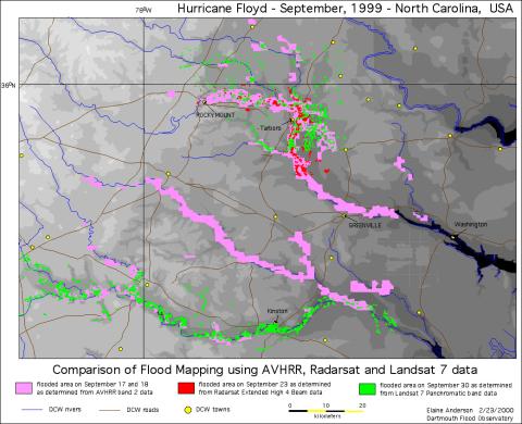
This flood map shows a comparison of the flood data collected by AVHRR (pink pixels), Radarsat (red pixels), and Landsat 7 (green pixels). These colors show areas that were flooded in the wake of Hurricane Floyd. Due to interference from clouds and forest canopies, geographers often get the best insight into a flood when they use data from multiple satellite sensors. Dartmouth Flood Observatory, E. Anderson and R.H. Brakenridge.

<img typeof="foaf:Image" src="http://statelibrarync.org/learnnc/sites/default/files/images/comparison.jpg" width="1041" height="846" />
Usage Statement: 

Creative Commons BY-NC-SA

This item has a Creative Commons license for re-use.  This Creative Commons BY-NC-SA license means that you may use, remix, tweak, and build upon the work for non-commerical purposes as long as you credit the original creator and as long as you license your new creation using the same license. For more information about Creative Commons licensing and a link to the license, see full details at https://creativecommons.org/licenses/by-nc-sa/4.0/.